Looking at a Volvo
← Back to Kevin's homepagePublished: 2017 October 22I rented a 2017 Volvo V60 T5 Cross Country for five days in Los Angeles. My use case was to drive three people around town in something more fun than the cheapest rental.
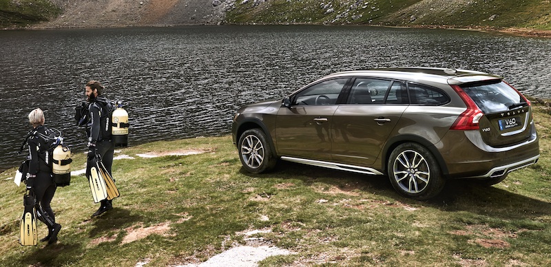
(I wish I’d gone offroad scuba diving in LA, but this photo is from Volvo.)
According to the Car and Driver review, the car I drove probably cost around $50,000.
I don’t have the expertise to critique the engine and driving characteristics, so I’ll stick with the user interface.
There was no manual in the car’s glove box, so I could only understand the car as it presented itself to me.
Really, this article is just an exercise in looking. I make a few comparisons with imagined alternatives, but I’m not trying to make any kind of argument — that some feature is good or bad, that my redesign is superior, that particular decisions reflect some amazing/terrible trend, etc.
I ask lots of questions, but can’t conclusively answer any of them.
Sometimes design is like that.
All we’re going to do is:
Look at dashboard in detail, from left to right. Feel free to skim.
Discuss rough notes about the rest of the car’s user interface (interior controls, etc.).
End with the discovery of a user-facing, critical safety problem. (If you feel that authors must provide some kind of conclusion, you can find one here.)
Okay, lets begin.
Dashboard
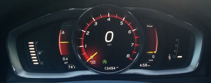
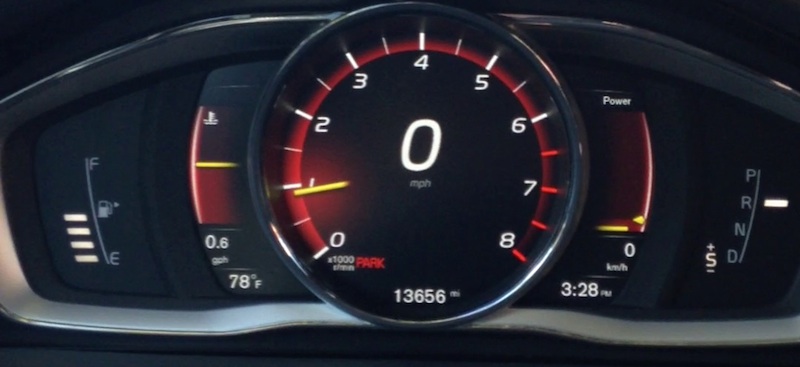
(Photo by the author, taken at a Volvo-safe 0 mph.)
Fuel gauge
Starting from the left, there’s a high contrast, quite readable fuel readout showing how many of the eight possible fuel bars are left in the tank. The placement of “F” and “E” and vertical rule bound the extent of the readout, which provides context as the white bars disappear entirely. The standard fuel pump icon has a little arrow to indicate that the tank is on the right side of the car.
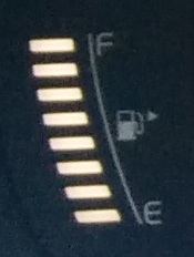
Why eight bars? The tank is 18 gallons, so each bar presumably represents 2.25 gal of fuel, meaning that the car can be refueled up to 45 miles away from the rental car center. (Just kidding Sixt! I filled it up across the street!) Showing more bars would provide additional granularity, shielding future rental car drivers from temptation.
Why not analog? Can’t have finer granularity than an analog gauge, which would also match the engine temperature and power gauges. However, visual matching here is a downside, as it makes it more difficult to quickly find the appropriate gauge while driving.
My best guess is that the fuel gauge was designed to visually balance with the (necessarily discrete) gear indicator on the right side of the dashboard. This also explains why the gauge doesn’t have any kind of range indicator or digital readout, which would break the symmetry. As for the choice of eight bars, that’s how many fit in the available vertical space.
Pleasing visual symmetry accomplished.
But why place the fuel gauge on the left? Placing it on the far right would reinforce the location of the fuel tank hatch on the right side of the car.
Perhaps the designers felt it more important for the gear indicator to appear closer to the physical gear selector?
Perhaps Volvo sells more cars to countries that drive on the left, and in those countries the cars have fuel tanks on the left. (Nope: photos from Australian and UK driving websites show the V60 with the same configuration — fuel gauge on the left, indicating a tank on the right.)
Engine temperature gauge
Moving to the right, there’s an analog engine temperature gauge, totally free of any kind of units, markings, or gradations:
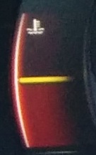
Why are there no gradations? I’m not a car expert, so I can imagine only two engine temperature conditions that a driver might care about: When it’s too hot (stop driving before the engine explodes) and when it’s too cold (driving or reving high will damage the engine because brittle gasket materials or thermally contracted mechanical clearances or something…).
Perhaps such temperature “danger zones” are implicit at the top and bottom of the gauge, and need no markings? Perhaps that feedback is given separately, only when relevant, via a blinking emergency light or angry beeping.
Or maybe the driver never needs such feedback, since the electronically controlled engine and automatic transmission can limit the throttle or shift into neutral to protect themselves?
Why have this gauge at all? Perhaps this gauge is helpful when driving on a track, where spirited driving could gradually bring the engine to an unsafe temperature. The driver could then estimate the number of laps they can drive before needing to stop and cool the engine.
Putting aside the number of people taking an all wheel drive station wagon to the track, if estimating remaining track time were the intended use case, why not convey that information directly with something that says “If you keep driving like this, your engine will melt in 20 minutes.”
(Perhaps car manufacturers are deliberately vague about the failure points of their equipment, lest precise specifications open them up to legal claims when those specifications are not met?)
The gauge does visually balance with the power gauge, but that balance is thrown off because of the vertical offset between the engine temperature icon and “Power” label.
But if the motivating concern is aesthetic, why not duplicate the power gauge to appear on both sides of the central dial, providing perfect symmetry?
Another possibility is that an analog engine temperature gauge is required in some jurisdictions. (This seems unlikely, as I’ve seen many cars without temperature gauges.)
Fuel consumption readout
Underneath the engine temperature gauge there’s a digital fuel consumption readout:
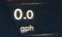
Why is the decimal typeface smaller? I couldn’t see a functional reason for this (there’s plenty of room in the display), but if it’s an aesthetic choice, I didn’t see it reflected anywhere else. However, I do appreciate that the readout displays consistent significant figures rather than truncating at the integers.
Why “gallons per hour”? I found the choice of unit surprising, since all other cars I’ve driven show “mpg” (miles per gallon), the standard fuel economy unit in the United States.
If the gauge is supposed to help the driver answer the question “how much longer can I keep driving like this?”, then it requires the driver be able to count the fuel bars, know that each represents 2.25 gallons, and do decimal multiplication, while driving.
So presumably this is not the purpose of this readout — if it were, it could show the estimated range directly (in miles or hours) rather than fuel consumption.
Perhaps Volvo, knowing that its customers would be stuck in LA traffic, choose the “gph” indicator to remind us exactly how much fuel we’re using, regardless of whether or not we’re moving. (Whereas an “mpg” gauge would always show zero for a gridlocked car.)
The car does have start-stop (the engine sometimes stops rather than idling), so the readout does assuage environmental guilt by occasionally showing 0.0.
Outdoor temperature readout
Next we have an outdoor temperature readout:

Why is this in Fahrenheit? Just kidding Volvo, this is America’s problem, ya’ll good. What another beautiful day in Los Angeles.
Central dial
Next we have the central dial, which includes a tachometer, speedometer, odometer, and indicator lights (green start-stop lit):
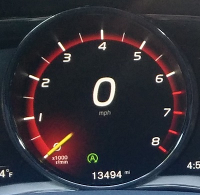
The speedometer digits are huge and contrast well with the black background, so I had no trouble reading it.
The tachometer is also straightforward to read, with a yellow disembodied “needle” floating above the labels, just like a physical needle would.
Why is there a tachometer? The car has an automatic transmission, so why bother the driver with a tachometer and the details of how fast the engine is spinning?
Volvo has taken this approach before: My girlfriend’s 1993 Volvo 240 has a full-sized analog clock in place of a tachometer, and that car is a manual. (An orange upshift arrow illuminates for hearing-impaired drivers who can’t feel the engine screaming for mercy.)
This automatic does accept shifting suggestions via the gear selector, so perhaps the tach is for the aforementioned spirited, track-driving station wagon owners?
Why a digital speedometer? I’m a fan of digital (meaning “shows digits”) speedometers, because they’re easier to read accurately compared to analog dials.
Furthermore, digital speedometers can support people who drive between, e.g., the US and Canada or the UK and France by allowing the unit to be toggled between “mph” and “kph”.
Physical dial speedometers can only support this use case with a secondary set of unit markings, which add visual noise.
However, that explanation doesn’t hold for this car, since the central dial is an LCD screen. There are no physical labels, and so any of the units could be changed regardless of the instrument being, um, skeuomorphed.
But if digital is more precise, why not just have both a digital speedometer and digital tachometer?
One explanation is that the two should be easily distinguishable, and the designers couldn’t find a way for two digital readouts to meet this criteria.
Perhaps there wasn’t enough space for so many digits in the center dial, but they didn’t want to move them further apart.
Or perhaps color coding schemes conflicted with the aesthetic color choices, lighting conditions, or some types of color blindness.
Or perhaps a dual-digital setup was never considered, to keep the dashboard familiar to the widest variety of drivers — after all, I’ve driven cars with dual dials, dial / digital, but never dual digital.
In any event, if only one can be digital, the speedometer makes sense.
One downside, though, of the digital speedometer is it cannot imply sweet, sweet performance — the 240 wagon’s speedometer goes up to 120 mph.
Finally, we have the bottom of the central dial:
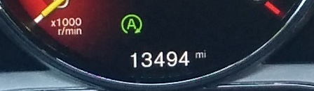
With just five digits, it looks like the odometer is out of space: What happens at 100,000? Will the type get smaller? Will the baseline simply move up? With the odometer switch to a proportional or condensed typeface?
And by 100,000, I meant 100000. Why not separate digits into groups? There’s no other option when the odometer is built from wheels with painted-on digits, but with a screen there is no technical limitation to adding commas, periods, or just thin spaces between groups of digits to make the number more readable.
As for the indicator lights, why is the start-stop light not centered? Presumably there are other indicator lights, but given that the start-stop light illuminates nearly every time the car is stopped, I’m surprised it’s not centered in the otherwise symmetry-happy dashboard.
Power gauge
I’ve never seen one of these before:
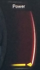
Like the engine temperature gauge, this one has no gradations or units. (In Sweden presumably the unit would be kilowatts. But in America, would it be foot-pounds / minute? Horses?)
In addition to the horizontal needle, there’s also a yellow arrow on the right that was always on or above the needle.
My interpretation of this gauge while driving is that the arrow indicated the additional power that would be instantaneously available, should I floor the accelerator. (Again, this car was not equipped with an instruction manual. If it had one, I definitely would have looked to see how the designers explained this gauge.)
Why is this gauge here? In a naturally aspirated engine, there’s a roughly linear relationship between engine power output and engine speed (Wikipedia), so a driver can estimate the available power by looking at the tachometer to see how much headroom they have until they hit engine RPM redline.
But this car is not naturally aspirated — it has a turbocharger, which is a fancy engine thingy that uses exhaust gas to shove additional air into the cylinders to make better explosions. However, the better explosions can only occur:
When the engine is at a high enough speed for the exhaust gas to be sufficiently pressurized
After the engine computer decides to redirect exhaust gas into the turbocharger
After spinny-bits inside of the turbocharger are spinning sufficiently fast
(Don’t quote me on this, I just read about turbo lag on Wikipedia and saw The Fast and the Furious once, ten years ago.)
What this means is that this Volvo has a non-linear power / engine speed curve, so available power can not be estimated directly from the tachometer.
So the gauge must be here to show the driver how much power is available.
But why power? What driving decisions does knowing the current and available engine power output help me make? Even if the gauge had units (“20 horses available”), that information is not directly applicable — the additional acceleration those horses could provide depends on factors like the current speed (because drag) and road inclination (because gravity).
If the gauge is supposed to answer “what if I floored the accelerator?”, why not answer in terms the driver can relate to: “in 3 seconds, you’ll be 13 mph faster”?
Finally, one last possibility is that this gauge exists to visually balance the engine temperature gauge.
Another digital speedometer
Underneath the power gauge, there’s a second digital speedometer, this time in kilometers per hour:
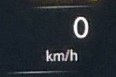
(All the same readability praise for digital speedometers as mentioned earlier.)
Why a second speedometer? Are there countries where the speed limits are posted in inconsistent units, so drivers should always know their speed in both?
Or is this seeming redundancy some kind of workaround? Perhaps the primary speedometer, despite being a computer screen, cannot have its units changed outside of the factory? I couldn’t find any physical controls around the dashboard or settings in the central console television that would let me change the primary speedometer units, so this secondary speedometer actually would have been useful if I’d driven my rental car into Mexico.
Or maybe this gauge is just a concession to the metric system Illuminati. In that case, why not show the outside temperature in Celsius? That way, I’d be able to impress sophisticated, European passengers by telling them about the weather.
A digital clock

It’s nice to know the time.
Why this time format? It makes sense to tie the primary speedometer units to the local road signage, but this linkage is less important for time, as those signs tend to be less common. (They still exist, though: Think parking restrictions or anti-congestion measures like “no left turn between 9–11 a.m.” or “2+ passengers in this lane after 3 p.m.”.)
In any case, some people simply prefer the 24-hour time format. Either way, I couldn’t figure out how to change the time format or set the time itself. (Perhaps it’s set via cellular signal?)
Why not other timers? A simple clock is nice to have on a dashboard, especially for drivers that don’t wear a watch.
I can imagine driving scenarios where other time mechanisms would be helpful too. Why not:
An estimated duration or arrival time, for when a destination is set in the navigation computer?
A lap timer and counter, for the track driver?
A “time spent driving” counter, either resettable (a “trip timer”) and/or with aggregate statistics (average time spent per day, total time spent per week, etc.) to help you reflect on life choices?
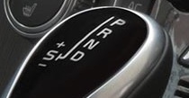
Transmission mode indicator
At long last, we’ve reached the final display on the far right of the dashboard!
Behold, the transmission mode indicator:
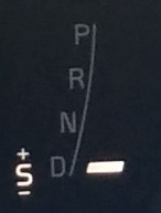
This is quite readable, with labels on the left of a vertical rule and an indicator bar on the right.
But why is it different than the graphic on the selector itself, which has the vertical rule in the middle, and labels on the right?
Because there is no indicator bar on the selector itself, leaving room for a more pleasing graphic design?
Or because the dashboard indicator serves two purposes: to indicate and to visually balance the fuel gauge?
Why is the “S” always highlighted? At first glance, you may think that I took this photograph while in “S” mode. (“Suggestion mode” enables an exciting kind of driving where the driver can politely ask the automatic transmission to shift.)
However, the “S” was always highlighted:
I never could figure out how to access the additional, more thrilling reverse gears…
I suspect that the reason the “S” is always highlighted is because this mode is only available on some configurations of the car.
Rather than maintain a supply chain for two versions of the physical instrument display, the designers decided to design a single display, using a backlit “S” that cheaper models would leave unilluminated.
(Could they actually reuse a single display for all vehicle configurations? Do the Swedish words for “park”, “reverse”, etc. begin with the same letters as in English?)
This isn’t the case with the label on the selector itself, since there necessarily must be two versions — the “S” one needs to move laterally so the driver can make suggestions, whereas the non-“S” one moves forward/backward only.
Why shift to neutral? During my driving in LA, I used transmission modes P, R, and D, but never N.
In what circumstances is it useful to shift an automatic transmission to neutral?
Perhaps if the car is being towed? However, in a hostile towing situation (done without the driver, due to, e.g., illegal parking), the gear selector is inaccessible, so that can’t be the reason. (Is there a special way to disengage the parking brake and shift a vehicle to neutral from the outside? Do tow trucks simply pick up the entire car? Or do you just hope your insurance company covers the damage?)
I can think of some edge cases where you’d want to move the wheels without moving the transmission/engine:
Moving your car by pushing it, rather than running it (to avoid exhaust in your indoor car showroom?).
Rotating a wheel while the car is jacked up, to diagnose tire damage.
Getting towed a short distance by a friend with a regular car/truck, who doesn’t have whatever fancy equipment real tow operators have.
Using a hill (with plenty of space below you) to test if the parking brake works.
However, these scenarios all seem very uncommon — so why not move the neutral control outside of prime real estate? As designed, the driver has to skip over this rarely-needed mode literally every time they drive.
Perhaps neutral needs to be quickly accessible so that the engine can be impressively revved at stoplights?
Or is this placement a safety measure, to prevent accidental shifts into reverse while the car is at speed? If so, alternative designs are potentially more effective:
The selector could remain physically locked in the current mode unless a trigger is depressed while moving it.
Reverse could be specifically protected behind a gesture more complex than push/pull: E.g., pushing down, then laterally (common on German manuals), holding a special reverse button for several seconds before shifting (BMW’s computer joystick thing), or requiring a ring on the stick to be pulled up before the shift (my girlfriend’s 240).
The transmission is driven by a computer, which could just refuse to shift when the car is moving forward.
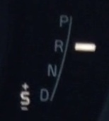
What about the parking brake? On several occasions during our trip, a certain driver (who shall remain nameless) attempted to drive with the parking brake engaged. I don’t blame them, since this dashboard clearly shows the car is in reverse:
Note how the red “PARK” in the center dial visually blends into the red gradients of the tachometer.
Why not:
Indicate park in the gear selector somehow?
Show “park” in huge letters instead of “0 mph”? (If the car is not at 0 mph while the brake is engaged, the display should read “good luck”.)
Indicate park in the center console TV, instead of showing the backup camera video (which provides further evidence to the driver that the car is ready to reverse)?
Automatically disengage the (electronically controlled) parking brake when the transmission is moved out of park? Or is there a circumstance when you want the parking brake engaged while the transmission in reverse, neutral, or drive? (Sick station wagon drifting is the only scenario I can think of, but to support that the parking brake would need to be hand-pulled rather than electronic.)
Other questions
Phew! Finally made across the dashboard!
But I have a few questions about the dashboard as a whole.
Why an LCD screen? The central cluster and its flanking engine temperature and power gauges are graphics on an LCD display.
There are some instances where the dashboard leverages the capabilities of a high-resolution display — notably starting the car, which treats the driver to a motion graphics extravaganza, followed by a brief diagram showing where people are sitting and whether they’re wearing their seat belts.
However, the dashboard spends most of its time pretending to consist of glowing analog instruments around digital speedometer.
So why bother with a screen?
The physical demands on a car dashboard are tough — prolonged exposure to outdoor temperature extremes, direct sunlight, humidity fluctuations, etc. — and it couldn’t have been cheap to switch from tested, working solutions (physical gauges) to a new technology.
Was the motivation simply in the expense, to position Volvo as a luxury brand?
If so, why did they leave out the fuel gauge and transmission indicator, which are fixed backlit “bars” with painted on labels?
What is the start-stop system doing? I had no problem getting used to the start-stop system stopping the engine when the car stopped. However, I found it extremely disconcerting when the engine started back up, without my input (i.e., while my foot was still firmly on the brake).
Presumably this happens to prevent the engine getting too cold or for the car to generate additional electricity from the alternator to power, e.g., air conditioning.
As a driver, I would have liked advance notice: Perhaps an “engine will start in 5 seconds” light, a chime, brake pedal vibration, or an “electricity” gauge with a marked position where the engine will start itself back up.
How far have I gone? Fine-grained distance information is helpful when navigating from pre-printed directions or via slow GPS (“in 1.2 miles, turn left”). I couldn’t find a resettable “trip odometer” or a way to set the primary odometer to show tenths of a mile. Both of these features exist, mechanically, on my girlfriend’s 1993 Volvo.
Was a deliberate decision made to remove these features from the dash in favor of the computerized navigation system?
How does this dash support safety? Volvo has a reputation for making safe cars, but no aspect of this dashboard stands out to me as being innovative or uniquely well-executed to support driving safety. (Of course, I could be missing plenty — perhaps they introduced the screen because their data show that mechanical instruments are more likely to injure drivers during collisions.)
The only instrument on this dashboard I’d never seen before is the power gauge, but I’m not sure how it connects to safety. It might even tempt certain drivers (certainly not this one) to repeatedly floor the accelerator in an attempt to understand what the gauge is meant to display.
If anything, I would have expected a modern Volvo dashboard to show information related to stopping — perhaps showing the time and/or distance it would take the car to come to a complete stop based on its current speed and road traction estimate. Such information would remind the driver to maintain a safe follow distance from other vehicles and drive at a speed suited for the lookahead visibility conditions.
Interior
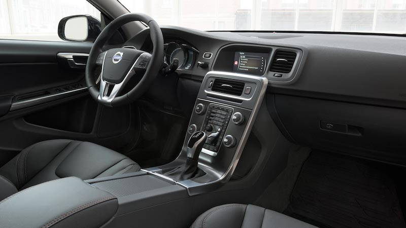
(Photo from Volvo Oklahoma City.)
The inside of the car is nice and quiet. Good job Volvo.
Chrome trim is inconsistent — it’s around the start button, but not around the key slot directly underneath it; around side air vents, but not center air vents. Why?
When the key is in the slot, other items on the keychain swing and bang loudly against the center console.
Speaking of key slot, the doors have keyless entry, but I still have to put the key in the slot to start the engine? Turns out, no, you don’t need to put the key in the slot. So why is there a slot?
The gear selector itself gets in the way when trying to adjust fan speed while car is parked.
The open area behind the center console is a neat idea. If I had a purse/handbag, I’d put it there.
The center cup holders are fairly high, such that a water bottle in either the front or rear cup holder interferes use of the gear selector.
No cup/bottle holders on either side door.
The back of the wagon has a storage shade that has to be manually pulled out and slotted into a base. My car has a removable cover suspended from the hatch to serve this same function, and it’s much more convenient because it requires no intervention.
Controls
- The TV has a navigation system, but I suspect its primary design goal was to fill out a brochure feature checklist:
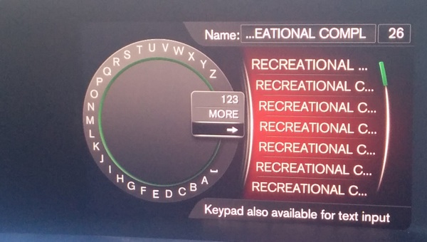 (Photo from author, immediately before opening Google Maps.)
The TV menus are controlled by one of the four equally sized, symmetric dials on the center console. Can you guess which one?
I couldn’t find a way to turn off or adjust the brightness of the TV.
Most of the console buttons had no visual feedback. E.g., pressing the seat warmer button shows a settings change on the TV, but not on the button itself (via a light or physical toggle). The fan speed dial, face/body/legs air vent selector, and temperature controls all showed feedback on the TV, but not anywhere near the button.
The dome lights were also designed this way: Rather than pressing the light itself to toggle on/off, there is a a separate overhead switch that controls each light.
The reverse camera remains on for several seconds after shifting from reverse to drive, which is disconcerting.
While in reverse, if the car detects a curb anywhere within about 5 feet of the vehicle it will begin to beep very loudly and with increasing frequency, like those radar guns from Alien. Yes buddy, I know there’s a curb — I’m parking.
The blind-spot indicator lights are hidden in the A-pillar, rather than on the side mirrors. They are dim and easy to overlook. Activating a turn signal while a car is in the blind spot causes the light to blink. Why not beep? I know you are capable of beeping loudly, Volvo, and this would be the situation in which to do it, since the whole point of this feature is that people don’t always look before turning.
Exterior
The rear hatch opens up pretty high, which might be a problem for short people — there is no handle on the base of the hatch or cloth loop. Upsell for self-closing hatch optional feature?
The mirrors automatically open/close when the car is unlocked via key fob buttons. It’s nice to get visual feedback about whether the car is locked/unlocked.
A critical safety problem
After discovering that the key slot was totally vestigial and there was no need to handle the key whatsoever, I left it in my backpack for the rest of the trip.
This led to the discovery of a safety critical problem when I was the passenger: I unlocked the passenger side door (via keyless entry button), then unlocked the full car from the interior button so that my friend could enter the car and drive.
My friend started the engine and we were half way out of the parking lot before we noticed that the mirrors had failed to open.
We were unable to find any direct mirror controls in the cabin, so we parked and power-cycled the vehicle, but this did not open the mirrors. It was only when we dug out the key fob and locked/unlocked the car that the mirrors opened.
So it appears that the mirrors are only opened/closed by either:
- the driver’s door keyless entry
- the lock/unlock buttons on the key fob
So it seems that, despite the best efforts of that Erlang QuickCheck company, Volvo is not doing a good job of exploring the state-space of their car.
I talked with a friend who had this same problem in his 2014 Volvo.
That a user-visible, safety critical problem, hasn’t been fixed in three years, together with the poor execution of the blind spot monitoring lights, leads me to conclude that Volvo has been coasting on its reputation for safety.
Wrap up
We looked closely at this car, mostly from the inside.
We asked a lot of questions.
We thought about design, not aesthetics.
Thanks
Thanks to Nicki Vance, Dan Luu, and Allie Jones for feedback on early drafts of this article!