Massing III: Embrace the slope.
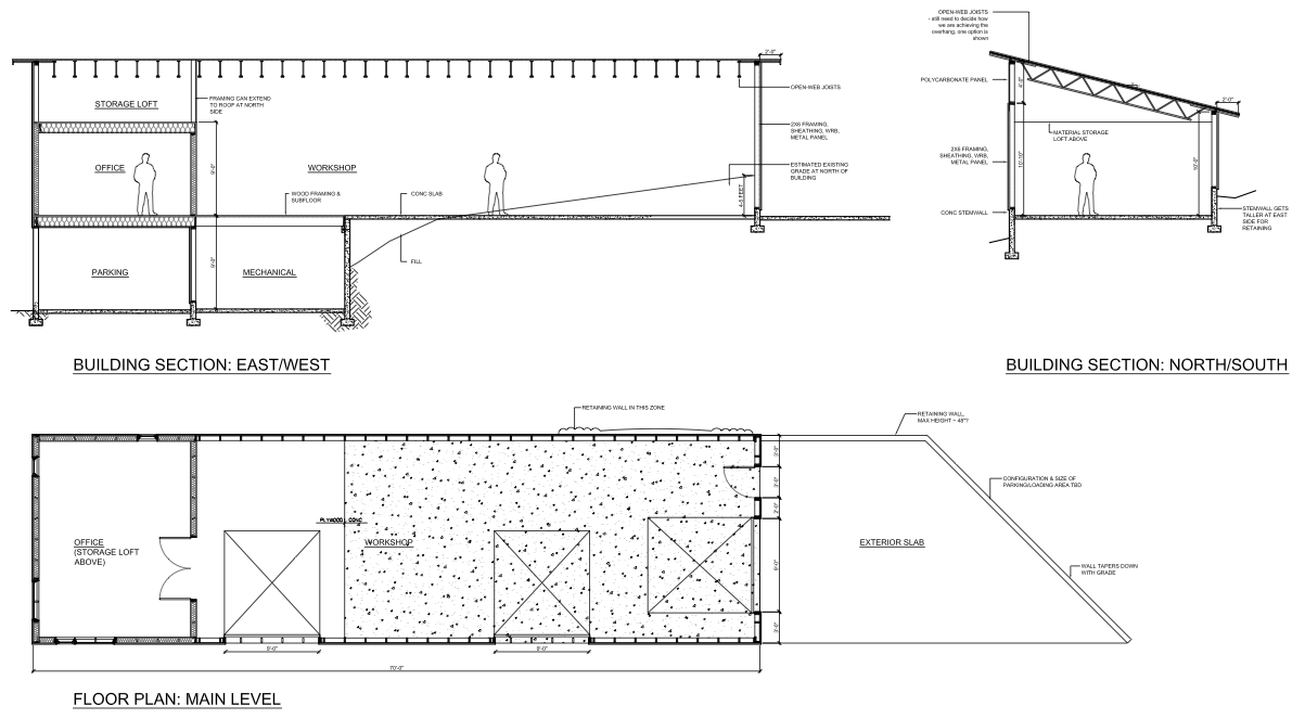
← Back to workshop series indexPublished: 2017 Feb 8Last updated: 2017 Mar 1After a geotechnical engineer crushed my dreams of building my workshop on basically the only flat part of my property, I went back to the drawing board. I’ve now decided to build on/into the slope north of the gravel drive, which gives me a roughly 60–70 ft. long by 20 ft. wide workshop space:

Because of the slope, the workshop will also form a natural lil’ carport on the lower side.
Based on cost, durability, and constructibility considerations, the materials palette for the workshop will be:
- metal siding (AEP Span Mini-V-Beam)
- standing seam metal roofing (AEP Span Design HP)
- polycarbonate clerestory windows
- glass/aluminum overhead doors (Based on two local quotes, I discovered that the the marginal cost of door is bizarrely low: A 10 ft. wide door costs ~10% more than a 5 ft. wide door, so the design should prefer fewer large doors over many smaller doors.)
Aesthetically, the biggest challenge is designing something that feels considered and deliberate, rather than the classic rural “mail-order metal building” look. (Not that I have anything against cheap barns.)
The 3:12 roof pitch and 20 ft. width gives the south face of the building dimensions of about 60–70 ft. long and about 15 ft. tall. This is a pretty vast expanse, which I’ll break up with some overhead doors for light/ventilation.
Visually, there are a few grids in play. The studs will be 2 ft. on center, so it’d be nice to line things up with that. The polycarbonate sheets must be supported by vertical mullions every 4 ft.
The interior plan is to have an insulated office above the carport and leave the rest of the building for uninsulated, flexible workshop space:
My buddy Matt helped me with an initial render:
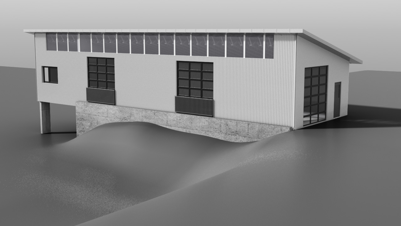
The design feels like a good start, but this render makes it clear that this arrangement of openings doesn’t quite feel coherent (rectangular overhead door lights conflict w/ square polycarbonate lights; office window doesn’t feel related to other elements, etc.)
So I’ll stick with the basic massing (which is structurally and economically sound) but need to try lots of different options with the polycarbonate clerestory, overhead doors, and windows.
I’ll be posting all my sketches below. If you have any questions, ideas, or suggestions, please email me or mention @lynaghk.


I showed this first batch of renderings to a handful of folks. A and B were strong contenders; people liked that the clerestory window was broken up, and that the edges of the central section lined up with the overhead doors.
In general, people preferred the designs that had a stronger implicit grid (e.g., H, compared to D or E)
My architect helpfully pointed out that running the clerestory windows all the way to the roof greatly simplifies the detailing and reduces the amount of flashing needed.
Folks were split (no pun intended) about how H and I separated visually indicated the separate office and workshop interior spaces. One friend pointed out that, aesthetics aside, stopping the roof overhang at the plane between the workshop and office would be difficult to effectively weather seal.
Personally, I wasn’t looking forward to trying to field cut-and-bend the metal roof panels down the office facade, as the panels be about 35 ft. long! I also think the workshop/office visual split feels a bit too “affected first year architecture student”.


In this batch, I constrained the clerestory windows to run all the way to the roof, to ease detailing. I tried to separate the office/workshop spaces in a less heavy-handed way (with the exception of K, which has the Portland-trendy metal picture frame box thing going on).
The tall vertical openings in J, L, M, O would be polycarbonate. Note that polycarbonate sheets are 4 ft wide and must be installed vertically so that any water that gets within their double-wall structure can drain effectively. This vertical constraint is why tall 4 ft sections can be run without mullions, but horizontal clerestory polycarbonate needs mullions every 4 ft.
None of these renderings really stood out for me.


Another batch of renderings. T is my favorite of the “visual split” category, but I don’t think it’s compelling enough to warrant the additonal effort of finding a second exterior cladding material (aluminum panels? hardipanels / cement board?), drawing flashing details, etc.


In this batch I realized I should try a single overhead door, since previously I’d only tried double doors. While sketching out different variations, it’s easy to forget the scale of this building; the single door of “W” looks small in comparison to the building facade, but it’s an 8 ft tall, 16 ft wide door. I realized that this door is larger than the entire wall of my girlfriend’s living room, and that it might feel unsettlingly to stand next to on the interior.
A friend recommended trying a smaller (not floor-to-ceiling) bump out for the office (in W, X, Y, Z), which I quite like. The overhead door is shorter to align with the bump out, which brings it to 8ft. The shorter overhead door means that there’s 4 ft between the top of the door and the bottom of the clerestory window, which helps the workshop facade feel much more solid.


I decided that bump outs were the way to go to add visual interest to the facade, and I started exploring the implications of the bump outs on the interior office space: Are they desks? Bay windows? Reading nooks? Exploring these ideas led to these two renderings.
After four weeks of sketching, I’m happy with the massing Z02. The bump outs, with their change of material (TBD, something that feels textured: integral colored cement board, corten, etc) provide visual interest on both the interior and exterior, without overly complicating the structure.
From here, the next step is to design the office interior. More on that later.